Showing posts with label recession. Show all posts

Wednesday, July 29, 2026

The looming trap for American banks: Why financial stability demands Fed intervention

The American banking sector currently faces an unprecedented level of interest rate risk that threatens the fundamental solvency of traditional lending models. After a decade of suppressed volatility, the rapid transition to a higher-rate environment has left many institutions holding vast portfolios of low-yield, long-duration assets—primarily Treasuries and mortgage-backed securities—that have suffered significant mark-to-market losses. Unlike the liquidity crises of the past, the current systemic fragility is rooted in a duration mismatch where the cost of liabilities (deposits) has adjusted upward far more rapidly than the yield on legacy assets, compressing net interest margins and eroding capital buffers across the industry.


This precarious position is the direct result of a unique "perfect storm" in the debt markets: a prolonged era of ZIRP (Zero Interest Rate Policy) overlapping with an un-inverted yield curve. During the low-rate years, banks were incentivized to "reach for yield" by extending duration. The curve then inverted, and now, as the yield curve moves toward a more "normal" upward slope—not through a drop in short-term rates, but through a "bear steepener" where long-term yields rise—the market value of those long-term holdings is cratering. This transition from an inverted curve to a positive slope is historically where the most acute financial accidents occur, as the "hidden" duration risk in bank portfolios is suddenly forced into the light by market pricing.

Consequently, the Federal Reserve is approaching a pivot point where its dual mandate of price stability and maximum employment may be eclipsed by its implicit third mandate: financial stability. To prevent a systemic de-leveraging event or a wave of technical insolvencies, the Fed will likely be forced to initiate a targeted form of Quantitative Easing (QE) specifically at the long end of the curve. By becoming the "buyer of last resort" for long-dated paper, the Fed can cap long-term yields, effectively engineering a ceiling on duration losses for the banking system. While this may complicate the inflation fight, the alternative—a disorderly collapse of bank balance sheets—is a risk the central bank cannot afford to take.

Monday, April 27, 2026

The asymmetric danger of short selling in a high-value market

The fundamental risk profile of short selling is defined by a harsh mathematical asymmetry. When you go "long" on a stock, your downside is strictly defined: the most you can lose is the 100% you initially invested, as a share price cannot drop below zero. Conversely, shorting flips this safety net on its head. Because there is no theoretical limit to how high a stock price can climb, a short seller’s potential losses are effectively infinite. You are contractually obligated to buy back those shares eventually to return them to the lender, regardless of whether the price has doubled, tripled, or surged by a factor of ten.

This unlimited risk is often realized through the "domino effect" known as a short squeeze. (See figure below. Data source: Board of Governors of the US Federal Reserve System; Chicago Board Options Exchange; via FRED.) When a heavily shorted security begins to rise unexpectedly, it triggers a panicked feedback loop. Short sellers, seeing their capital evaporate, rush to buy back shares to "cover" their positions and mitigate further damage. This sudden wave of buying pressure—ironically coming from those who bet against the stock—drives the price even higher. As the price climbs, it hits the "stop-loss" orders of more short sellers, forcing them to buy as well, which creates a self-fulfilling prophecy of rapidly escalating prices that can decouple entirely from the company's actual value.


Compounding these market dynamics is the structural danger of using margin. Shorting is rarely done with pure cash; it is an inherently leveraged move using borrowed funds. As the stock price rises against you, your collateral shrinks relative to the size of the position, often triggering a "margin call." At this stage, your broker may demand an immediate cash infusion to keep the trade open. If you cannot meet this requirement, the broker maintains the legal right to execute a "forced buy-in," closing your position at the current market price without your consent. This locks in your losses at what might be the worst possible moment. Understanding these mechanics is vital in the current climate, where an elevated VIX indicates high volatility and a highly-priced market leaves little room for error.

Friday, March 27, 2026

Understanding the "warp" in long-term Treasuries

A common point of confusion for many investors is the distinction between average maturity and effective duration, two metrics that are often used interchangeably but serve very different roles in a portfolio. Average maturity represents the weighted average of the time remaining until the bonds in a fund reach their final payment date. Effective duration, however, measures the fund's actual price sensitivity to interest rate changes. For a fund like the Vanguard Long-Term Treasury ETF (VGLT), this gap is significant. As of early 2026, VGLT carries a weighted average maturity of approximately 21.90 years, yet its effective duration sits lower at roughly 14.10 years. (See figure below. Data source: Vanguard.) This occurs because the semi-annual coupon payments "shorten" the economic life of the investment, meaning you recover your capital faster than the final maturity date suggests.


The primary reason to understand the difference between these measures is to predict how your principal will react to a changing rate environment. The mathematical relationship is inverse: when interest rates go down, the principal value of the bond fund goes up. Using VGLT’s current effective duration of 14.10 as a guide, we can quantify this "warp" in value. If the 10-year and 30-year Treasury yields were to drop by 1% (100 basis points), the share price of VGLT would be expected to rise by approximately 14.10%. This leveraged-like sensitivity is exactly why long-term Treasuries are favored by those looking to hedge against economic slowdowns, as the price appreciation can be substantial during a "flight to safety."

This distinction is the cornerstone of sophisticated bond investing and the reason why this post is important. If an investor looks only at the 21.9-year maturity of VGLT, they might overestimate the time their capital is locked away or the immediate volatility of the fund. Conversely, failing to account for the 14.10 duration means ignoring the precise tool used to calculate risk. By understanding that effective duration is the "speedometer" of one’s bond portfolio’s price movement, one can better position their assets to benefit from shifting yields rather than being caught off guard by them. (Disclosure: the author owns VGLT shares at the time of this writing.)

Thursday, November 27, 2025

The hidden power of capital gains in US Treasury investments

For many investors, U.S. Treasuries are synonymous with safety and fixed income, providing a stable stream of coupon payments. However, a less-appreciated source of return is the capital gain realized through principal appreciation. This occurs because bond prices move inversely to interest rates. When the prevailing market interest rates fall, the value of existing bonds with higher, fixed coupon rates rises in the secondary market. If a bond is purchased at par and subsequently sold at a premium due to a drop in yields, the investor captures a capital gain in addition to the accrued interest. This mechanism transforms Treasuries from simple income generators into instruments with significant price volatility and appreciation potential when the market anticipates, or begins to realize, a decline in borrowing costs (see Figure 1).


The scale of this principal appreciation is not uniform across all maturities; rather, it is directly tied to the bond’s duration, which is closely correlated with its time to maturity. Simply put, for an identical percentage point decrease in interest rates, a bond with a longer maturity will experience a disproportionately larger increase in price than a short-term note. This principle stems from the mathematics of present value. Longer-dated bonds possess cash flows (coupons and principal repayment) that are discounted over a longer period. As the discount rate (the prevailing interest rate) decreases, the present value of those distant cash flows increases dramatically. This sensitivity makes longer-maturity Treasuries the most potent way to capitalize on falling rates, embodying the core risk/reward trade-off known as interest rate risk.

Understanding this duration-based leverage is critical for tactical investors. In environments where the Federal Reserve or global economic forces are signaling a shift toward monetary easing, taking a substantial position in long-term Treasuries—such as the 20- or 30-year bonds—can unlock significant capital gains. (This can be done indirectly by investing in funds such as the VGLT.) If a bond with a 20-year duration, for instance, sees its yield fall by just 100 basis points (1.00%), its principal value will appreciate by roughly 20%. This leverage allows investors to achieve equity-like returns from a sovereign debt instrument during periods of yield decline. Therefore, an informed strategy recognizes that long-term Treasuries are not merely hold-to-maturity assets, but powerful tools for capital appreciation in anticipation of a rate-cutting cycle.

Wednesday, October 29, 2025

The inescapable signal of a Fed rate cut

The Federal Reserve maintains a consistent, albeit uncomfortable, doctrine: it does not cut the short-term Federal Funds Rate into a demonstrably strong economy. An easing of monetary policy is fundamentally at odds with an environment characterized by robust GDP growth, tight labor markets, and persistent inflationary pressures. When the economy is performing optimally, the central bank’s primary concern remains stability and price control, necessitating a neutral or restrictive stance. Therefore, the first rate cut following a significant tightening cycle should never be viewed as a reward for economic strength. Instead, it is a signal—a tacit admission by the Federal Open Market Committee (FOMC) that the prior restrictive policy has finally slowed demand sufficiently, and that the underlying economic momentum is beginning to stall. It is the central bank acknowledging that the risk has officially shifted from inflation to unemployment and contraction.

This critical signaling function leads directly to the next point: for each quarter-point reduction, the statistical probability of a recession in the very near future noticeably increases. A 25-basis point cut is rarely a pre-emptive, surgical strike; it is often a reactive measure taken when leading indicators, or even coincident data, begin to seriously falter. The Fed is not merely easing; it is attempting to manage a deterioration that has already begun. The deeper the central bank is forced to cut—moving from an initial 'insurance' cut to a pattern of successive, reactive cuts—the more apparent it becomes that the economic ailment is severe. These incremental reductions, therefore, function less as instant stimulus and more as a lagging indicator of accelerating risk, confirming that the central bank’s restrictive measures finally broke something critical in the economic engine.


History offers a chilling confirmation of this pattern, which holds true almost all the time. Since the early 1970s, nearly every significant Fed easing cycle that followed a sustained period of rate hikes has culminated in, or immediately preceded, a recession. The initial cuts that mark the beginning of an aggressive easing phase are typically followed by a full-blown economic downturn within the subsequent 12 to 18 months. While policymakers and commentators occasionally dream of achieving a perfect 'soft landing,' the data suggests that once the Fed has tightened enough to necessitate a decisive pivot to cutting, the underlying damage is already done, and the recessionary forces have been unleashed. Prudent investors must view the commencement of a rate-cutting cycle not as a cause for celebration, but as a definitive, high-confidence warning sign that the economy is transitioning into a high-risk phase.

Thursday, August 28, 2025

The recent cooling of the U.S. economy: Tariffs or Fed tightening?

The recent cooling of the U.S. economy has sparked a debate, with some commentators pointing to trade tensions and tariffs as the primary culprits. While it is true that tariffs can disrupt supply chains and raise costs, their impact on an economy the size of the United States is often overstated. Instead of focusing on external factors, a more accurate assessment of the current economic slowdown requires a look at domestic monetary policy. The Federal Reserve, by raising its federal funds rate and keeping it elevated for an extended period, has directly engineered a slowdown in economic activity. This policy tightens financial conditions, making it more expensive for businesses to borrow and invest and for consumers to purchase big-ticket items like homes and cars.

History provides a powerful precedent for this economic dynamic. In the early 1980s, under the leadership of then-Fed Chair Paul Volcker, the central bank aggressively hiked interest rates to combat rampant inflation. The federal funds rate soared to a staggering 20%, a move that successfully crushed inflation but also intentionally triggered a severe recession (see figure below: Fed Funds Effective Rate - Gross Domestic Product). This historical episode serves as a clear example of the Fed's immense power to slow down the economy through monetary policy. The current situation mirrors this playbook, albeit on a less dramatic scale, as the Fed's actions have systematically removed liquidity from the financial system and reduced demand.


To see this cause-and-effect relationship in action, one only needs to look at the data. A review of historical economic trends reveals a strong correlation between the federal funds rate and overall economic growth, as measured by GDP. The periods following sustained rate hikes often coincide with periods of economic contraction or slower growth. The data clearly shows that the real force at play in the current economic environment is not trade policy, but the deliberate and often-overlooked decisions of the central bank. For a brief discussion on this, along with a few other related topics, please refer to the video linked below.

Wednesday, May 28, 2025

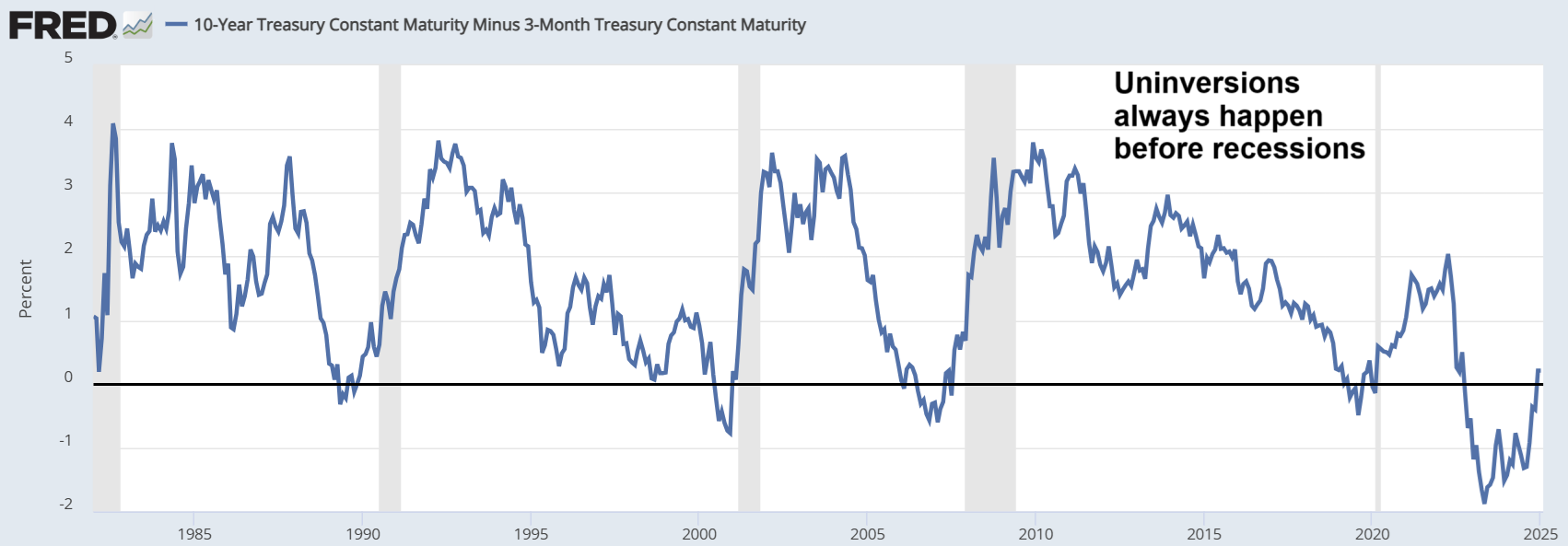
Yield curve inversions, un-inversions, and US recessions

The figure below (source: Federal Reserve Bank of St. Louis) displays the spread between the 10-year and 3-month U.S. Treasury yields from the early 1980s through 2025. This yield spread is a closely watched indicator in financial markets, as it reflects investor expectations about future economic conditions. A yield curve inversion—occurring when the spread falls below zero, meaning short-term interest rates exceed long-term rates—has historically been associated with upcoming recessions. Economists and policymakers often regard this inversion as a reliable leading indicator, given its strong track record in signaling economic downturns with a lead time of several months to over a year. As shown in the graph, each sustained inversion over the past four decades has typically preceded a recession, underscoring its continued relevance in macroeconomic forecasting.


It is important to note that the yield curve typically un-inverts, or returns to a positive slope, before a recession actually begins. In the graph, recessions are represented by the shaded areas, and a close examination reveals that the un-inversion often precedes the onset of these downturns. However, the time gap between the un-inversion and the start of a recession can vary significantly, ranging from a few months to over a year. This variability highlights the complexity of using the yield curve as a precise timing tool, even though it remains a valuable early warning signal. For a brief discussion on this pattern, along with a few other related topics, please refer to the video linked below.

Wednesday, April 30, 2025

A simulation-based valuation of the S&P 500: April 2025

The figure below shows two simulation-based valuations of the S&P 500. They assume a fair price-to-earnings (PE) ratio for the S&P 500 that is the inverse of half of the 10-year U.S. Treasury yield. The price (at the top) is the most recent top value of the S&P 500.


The numbers on the left consider a more benign scenario: S&P 500 earnings in 2025 are up by 13% from the previous year, and the 10-year U.S. Treasury yield is at 3.61%. The numbers on the right refer to a less positive scenario: S&P 500 earnings are up by 6%, and the 10-year U.S. Treasury yield is at 4.17%.

The second scenario takes us to a fair price for the S&P 500 of 2,673.79, which is 56.48% down from the most recent high. The video linked below discusses these simulations, some of the most recent values for the simulation inputs, and a few other things.

Tuesday, January 28, 2025

The yield curve uninversion is here

The figure below shows the graph of the 10y-3m Treasury yields for the period going from the early 1980s to 2025. The inversion in the 10y-3m graph is the best indication of an impending economic recession in the US, and that graph uninverts immediately prior to a recession.


As you can see, the uninversion of the 10y-3m Treasury yield curve is here, and universions always happen before recessions. Interestingly, this is happening at a time when many aspects of the US economy look strong. The video linked below provides a brief discussion on this a few other related issues.

Thursday, October 31, 2024

How to beat the S&P 500 without much effort: A one-year moving average strategy


Summary

- One of the most successful strategies for long-term investment returns is to buy and hold a broad-coverage index fund.

- The SPY is an exchange-traded fund (ETF) that tracks the S&P 500, and is a good example of broad-coverage index fund.

- A simple strategy can be devised to obtain even better than buy-and-hold long-term returns, employing fast- and slow-moving averages.

- We explain and test a one-year moving average strategy that in the long term performs significantly better than buying and holding SPY.

The one-year moving average for SPY from 1995 to 2018

The graph below has been created with Yahoo Finance (). It shows the variation of the SPY exchange-traded fund (ETF) from 1995 to 2018 (in red), plus the one-year moving average during that period (in blue). The SPY tracks the S&P 500 index, and had a net expense ratio of 0.09% at the time of this writing. One of the advantages of index funds is that they have a low expense ratio compared with actively-managed mutual funds.


Note that there are two moving averages in the graph: (a) the SPY “share” price (or net asset value per share) at any given time, which is the fastest moving average possible for the fund; and (b) the SPY’s one-year moving average, which is a slow-moving simple average of the fund’s share prices. (see ).

Simple inspection would suggest that, after an initial purchase, one would do better than holding SPY by employing a simple two-step strategy: (1) sell when the SPY crosses below its one-year moving average; and (2) buy back when SPY crosses above its one-year moving average.

A test of the strategy

While on the graph the simple strategy above may look appealing, the strategy must be tested with real data and under realistic assumptions. The figure below shows part of a screen snapshot of a test of the strategy, with multiple trades on a spreadsheet. Each row of the spreadsheet corresponds to one trade. The first row corresponds to the initial buy. A conservative fee of US$ 40 per trade is assumed, in part to account for bid-ask spread losses.


The figure below shows the final rows of the simulation, the result of a comparison buy-and-hold baseline strategy, and the percentage difference. Starting with an investment of US$ 100,000 made in January 1, 1995, the simple one-year moving average strategy gets us to US$ $980,558 on January 1, 2018. The buy-and-hold baseline strategy gets us to US $611,714. That is, the simple one-year moving average strategy performs about 60 percent better.


The simulation disregards dividends and sweep account gains (whereby cash earns interest). At the time of this writing, one could easily get money market yields in sweep accounts that were comparable in value to the SPY dividend.

Is the 365 days used for the moving average optimal? Probably not, but our simulation suggests that this number is effective at limiting false positives while at the same time capturing major drops of the index (e.g., those in the two recessions in the period considered). False positives would be much more frequent with a faster moving average, such as a 50-day moving average. If too frequent, false positives can significantly increase trading-related losses, to the point of negating the benefit of the strategy.

Thursday, July 25, 2024

A simulation-based valuation of the S&P 500: July 2024

The figure below shows two simulation-based valuations of the S&P 500. They assume a fair price-to-earnings (PE) ratio for the S&P 500 that is the inverse of half of the 10-year U.S. Treasury yield. The price (at the top) is the most recent top value of the S&P 500.


The numbers on the left consider a more benign scenario: S&P 500 earnings in 2024 are up by 12.10% from the previous year, and the 10-year U.S. Treasury yield is at 4.28%. The numbers on the right refer to a less positive scenario: S&P 500 earnings are up by 9.90%, and the 10-year U.S. Treasury yield is at 4.28%.

The second scenario takes us to a fair price for the S&P 500 of 2,843.17, which is 49.37% down from the most recent high. The video linked below discusses these simulations, some of the most recent values for the simulation inputs, and a few other things.

Wednesday, May 29, 2024

Tontines: Could they help the economy?


Summary

- Even before the COVID-19 pandemic, the global economy was experiencing a slowdown. One important reason behind this slowdown has been the aging of the world population.

- Seniors tend to be savers. Therefore, as seniors become a larger part of the global population, this puts downward pressure on global consumer spending.

- Tontines are financial plans that combine elements of retirement annuities and lotteries. The longer a tontine member lives, the greater is the potential for an outsized return on his or her initial investment.

- By definition, individuals cannot outlive their initial contribution to a tontine.

- One possible advantage of tontines is that they could stimulate spending among seniors.

The problem

Even before the COVID-19 pandemic, the global economy was experiencing a slowdown. One important reason behind this downward economic trend has been the aging of the world population. (). There have been increasingly more seniors as a percentage of the population of most countries, particularly in developed countries.

Seniors tend to be savers. Therefore, as seniors become a larger part of the global population, this puts downward pressure on worldwide consumer spending. And consumer spending drives the global economy. Adding to this is the fact that, with fixed income returns going down, the economic environment is increasingly hostile to savers. Returns are depressed, which can lead to a propensity to save even more.

What are tontines?

Tontines are financial plans that combine elements of retirement annuities and lotteries. They were popular in the 1700s and 1800s. Many different variations are possible (), with various contribution and distribution rules. The following items give an idea of what a tontine could look like from a financial perspective:

- Each of a group of seniors makes an initial contribution to the tontine.

- The tontine members start receiving distributions.

- As tontine members die, their distributions are made to the surviving members.

- A small number of survivors receive a final lump-sum payment.

The longer a tontine member lives, the greater is the potential for an outsized (or asymmetric) return on his or her initial investment. In the basic simulation below, one could receive payments for a number of years, and nevertheless end up with a lump-sum payment that is 10 times the person’s initial investment.

A basic simulation

Let us assume that we have a tontine with 1,000 members, each contributing 100 thousand dollars by the time they reach age 65 (see table below). When they reach that age, they start receiving 4% yearly dividends. The total assets under management here would then be 100 million dollars.


We are assuming that the tontine would be managed by an organization that would be able to pay the 4% in dividends to the tontine members and still make a profit. This organization would have to not only manage the funds but also make sure that no fraud is committed. For example, deaths would have to be properly logged.

Also, we are assuming in this simulation a bell-shaped (i.e., normal) life expectancy distribution centered at age 80, with a standard deviation of 10 years. This means that, of the initial 1,000 individuals, approximately 16% would have died after 5 years (age 70). And, approximately 50% would have died after 15 years (age 80).

Still consistently with a normal distribution, after 25 years (age 90), approximately 16% of the original tontine members would still be alive. Soon after that, when only 10% of the remaining tontine members were still alive, each would receive a lump-sum payment of 1 million dollars.

As you can see, the dividend received by each surviving tontine member goes up over time, growing exponentially over time. This is highlighted in the figure below. If the members of a tontine had slightly different ages, which is likely, their distributions could be adjusted accordingly without affecting this exponential growth.


Currently there are a number of legal obstacles to the establishment of tontines. Among them are insurance and gambling laws at the local and federal levels. It would probably take targeted legislation at the federal level to overcome all of the obstacles to nationwide tontines, which would probably be preferable to local tontines (e.g., tontines where all members are from the same city).

How can this help the economy?

One possible advantage of tontines is that they could stimulate spending among seniors. As noted earlier, the trend for the future is a growing percentage of seniors in the population of most countries, and seniors tend to be savers. Since consumer spending is a major component of most national economies, this spells trouble for most countries’ finances and the global economy.

Seniors tend to be savers in part because they fear outliving their savings – this is one of their main fears (). That is, the prospect of living a long life is a major source of financial stress, which may shorten that life. With a tontine, the longer one lives the more income one gets, with a nice payout waiting for the oldest surviving members.

By definition, individuals cannot outlive their initial contribution to a typical tontine. As the world population ages, tontines could significantly increase consumer spending, even if that extra spending in restricted to the tontine’s annual distribution.

Friday, October 20, 2023

A simulation-based valuation of the S&P 500: October 2023

The figure below shows two simulation-based valuations of the S&P 500. They assume a fair price-to-earnings (PE) ratio for the S&P 500 that is the inverse of half of the 10-year U.S. Treasury yield. The price (at the top) is the most recent top value of the S&P 500.


The numbers on the left consider a more benign scenario: S&P 500 earnings in 2023 are up by 3.20% from the previous year, and the 10-year U.S. Treasury yield is at 4.91%. The numbers on the right refer to a less positive scenario: S&P 500 earnings are up by 1.10%, and the 10-year U.S. Treasury yield is at 5.47%.

The second scenario takes us to a fair price for the S&P 500 of 2,015.07, which is 58.18% down from the most recent high. The video linked below discusses these simulations, some of the most recent values for the simulation inputs, and a few other things.

Thursday, September 28, 2023

A simulation-based valuation of the S&P 500: September 2023

The figure below shows two simulation-based valuations of the S&P 500. They assume a fair price-to-earnings (PE) ratio for the S&P 500 that is the inverse of half of the 10-year U.S. Treasury yield. The price (at the top) is the most recent top value of the S&P 500.


The numbers on the left consider a more benign scenario: S&P 500 earnings in 2023 are up by 3.20% from the previous year, and the 10-year U.S. Treasury yield is at 4.62%. The numbers on the right refer to a less positive scenario: S&P 500 earnings are up by 1.20%, and the 10-year U.S. Treasury yield is at 5.48%.

The second scenario takes us to a fair price for the S&P 500 of 2,012.28, which is 58.24% down from the most recent high. The video linked below discusses these simulations, some of the most recent values for the simulation inputs, and a few other things.

Saturday, September 16, 2023

How many times until a coincidence becomes a pattern? The case of yield curve inversions preceding recessions and the magical number 7

Let us say that a coincidence involving two events, where one seems to predict the other, happens a number of times. How many times until it can be considered not only a coincidence, but a statistically significant pattern? We propose a framework to answer this question. Using the framework, we find that the number of times required is 7. We illustrate the practical application of our framework in the context of a very important phenomenon: When the percentage difference between 10-year and 3-month U.S. Treasury yields falls below zero, a U.S. recession appears to occur within the next 18 months.

All of this is laid out in much more detail in the article linked below. In this article, we have established the minimum number of times required for the inversion-recession phenomenon to be deemed more than a coincidence, and rather a statistically significant pattern. That number is 7. Therefore, given that since 1970 we have observed 8 instances of the inversion-recession phenomenon, we can conclude that this not a coincidence, and that it is in fact a statistically significant pattern.

https://www.tandfonline.com/doi/full/10.1080/03610926.2023.2232908

The video below complements this post, by briefly addressing some of the issues discussed in the post.

Friday, March 17, 2023

The big difference between today and the 1980s: Valuations

The figure below shows two main graphs. The graph at the top shows the Fed funds rate from 1978 to 1987, approximately the period in which Paul Volcker served as Chair of the Federal Reserve. Rate hikes preceded the 1980 recession. Rates were raised again around 1981, then reduced, and then raised again; leading to the 1981-1982 recession.


The graph at the bottom shows the U.S. 10 Year Treasury yield, the CPI inflation rate (left scale), and the value of the S&P 500 index (right scale). Note that the U.S. 10 Year Treasury yield generally followed the Fed funds rate in the period, and that both were high while CPI inflation was still within approximately two-thirds of its previous peak. Interestingly, the S&P 500 was mostly flat during this period of major turmoil.

Could one conclude that the Fed’s current hiking cycle to combat inflation may have a similar outcome – i.e., a period where the S&P 500 is mostly range-bound? While it is possible that the answer to this question is “yes”, there is a big difference between today and the 1980s, namely valuations. The figures below show the valuations in the 1980s and now.


As you can see, valuations in the 1980s during the two recessions were largely below 10, whether we look at the S&P 500 PE ratio or the corresponding inflation-adjusted Shiller PE10 ratio. Today they are slightly above 20 (PE ratio) and 27 (PE10 ratio). The video linked below discusses these and related issues, as well as some recent developments.

Tuesday, February 14, 2023

A simulation-based valuation of the S&P 500: February 2023

The figure below shows two simulation-based valuations of the S&P 500. They assume a fair price-to-earnings (PE) ratio for the S&P 500 that is the inverse of half of the 10-year U.S. Treasury yield. The price (at the top) is the most recent top value of the S&P 500.


The numbers on the left consider a more benign scenario: S&P 500 earnings in 2023 are up by 4.70% from the previous year, and the 10-year U.S. Treasury yield is at 3.73%. The numbers on the right refer to a less positive scenario: S&P 500 earnings are up by 4.70%, and the 10-year U.S. Treasury yield is at 4.30%.

The second scenario takes us to a fair price for the S&P 500 of 2,537.50, which is 47.34% down from the most recent high. The video linked below discusses these simulations, some of the most recent values for the simulation inputs, and a few other things.

Monday, January 16, 2023

A simulation-based valuation of the S&P 500: January 2023

The figure below shows two simulation-based valuations of the S&P 500. They assume a fair price-to-earnings (PE) ratio for the S&P 500 that is the inverse of half of the 10-year U.S. Treasury yield. The price (at the top) is the most recent top value of the S&P 500.


The numbers on the left consider a rather benign scenario: S&P 500 earnings in 2023 are up by 4.70% from the previous year, and the 10-year U.S. Treasury yield is at 3.49%. The numbers on the right refer to a more likely scenario: S&P 500 earnings are up by 4.70%, and the 10-year U.S. Treasury yield is at 4.22%.

The second scenario takes us to a fair price for the S&P 500 of 2,667.12, which is 44.65% down from the most recent high. The video linked below discusses these simulations, some of the most recent values for the simulation inputs, and a few other options.

Friday, December 23, 2022

A simulation-based valuation of the S&P 500: December 2022

The figure below shows two simulation-based valuations of the S&P 500. They assume a fair price-to-earnings (PE) ratio for the S&P 500 that is the inverse of half of the 10-year U.S. Treasury yield. The price (at the top) is the most recent top value of the S&P 500.


The numbers on the left consider a rather benign scenario: S&P 500 earnings in 2022 are up by 5.60% from the previous year, and the 10-year U.S. Treasury yield is at 3.75%. The numbers on the right refer to a more likely scenario: S&P 500 earnings are up by 3.10%, and the 10-year U.S. Treasury yield is at 4.00%.

The second scenario takes us to a fair price for the S&P 500 of 2,644.39, which is 45.12% down from the most recent high. The video linked below discusses these simulations, some of the most recent values for the simulation inputs, and a few other options.

Friday, October 21, 2022

A simulation-based valuation of the S&P 500: October 2022

The figure below shows two simulation-based valuations of the S&P 500. They assume a fair price-to-earnings (PE) ratio for the S&P 500 that is the inverse of half of the 10-year U.S. Treasury yield. The price (at the top) is the most recent top value of the S&P 500.


The numbers on the left consider a rather benign scenario: S&P 500 earnings in 2022 are up by 10% from the previous year, and the 10-year U.S. Treasury yield is at 3.00%. The numbers on the right refer to a more likely scenario: S&P 500 earnings are up by 5%, and the 10-year U.S. Treasury yield is at 4.00%.

The second scenario takes us to a fair price for the S&P 500 of 2,693.12, which is 44.11% down from the most recent high. The video linked below discusses these simulations, some of the most recent values for the simulation inputs, and a few other options.