Wednesday, July 29, 2026

The looming trap for American banks: Why financial stability demands Fed intervention

The American banking sector currently faces an unprecedented level of interest rate risk that threatens the fundamental solvency of traditional lending models. After a decade of suppressed volatility, the rapid transition to a higher-rate environment has left many institutions holding vast portfolios of low-yield, long-duration assets—primarily Treasuries and mortgage-backed securities—that have suffered significant mark-to-market losses. Unlike the liquidity crises of the past, the current systemic fragility is rooted in a duration mismatch where the cost of liabilities (deposits) has adjusted upward far more rapidly than the yield on legacy assets, compressing net interest margins and eroding capital buffers across the industry.


This precarious position is the direct result of a unique "perfect storm" in the debt markets: a prolonged era of ZIRP (Zero Interest Rate Policy) overlapping with an un-inverted yield curve. During the low-rate years, banks were incentivized to "reach for yield" by extending duration. The curve then inverted, and now, as the yield curve moves toward a more "normal" upward slope—not through a drop in short-term rates, but through a "bear steepener" where long-term yields rise—the market value of those long-term holdings is cratering. This transition from an inverted curve to a positive slope is historically where the most acute financial accidents occur, as the "hidden" duration risk in bank portfolios is suddenly forced into the light by market pricing.

Consequently, the Federal Reserve is approaching a pivot point where its dual mandate of price stability and maximum employment may be eclipsed by its implicit third mandate: financial stability. To prevent a systemic de-leveraging event or a wave of technical insolvencies, the Fed will likely be forced to initiate a targeted form of Quantitative Easing (QE) specifically at the long end of the curve. By becoming the "buyer of last resort" for long-dated paper, the Fed can cap long-term yields, effectively engineering a ceiling on duration losses for the banking system. While this may complicate the inflation fight, the alternative—a disorderly collapse of bank balance sheets—is a risk the central bank cannot afford to take.

Sunday, June 28, 2026

Inverse leveraged funds: The destructive effect of sucker rallies


Summary

- One can make money shorting the market using inverse leveraged funds.

- Inverse leveraged funds are not for buy-and-hold investors.

- They are risky bets, which can lead to significant gains or losses.

- One key source of risk are upward rallies. This is demonstrated through spreadsheet-based simulations.

The performance of two inverse leveraged funds

The graph below shows the performance of two popular inverse leveraged funds () during a period of a little less than 20 days in December of 2018. They are available as exchange-traded funds (ETFs). One is the ProShares UltraPro Short S&P500 (SPXU), which tends to replicate the daily performance of the S&P 500 times -3. For example, if the S&P 500 drops 1 percent in one day, the fund goes up 3 percent. The other fund on the graph is the Direxion Daily Small Cap Bear 3X ETF (TZA), which tends to replicate the daily performance of the Russell 2000 index times -3.


I owned shares of these two funds during the time period shown. As you can see from the graph, if you invested in these funds during the period shown, your investment in SPXU would have gone up 31.41 percent. The investment in TZA would have gone up 44.99 percent. This is a period of time in which the S&P 500 had gone down 8.9 percent, and the Russell 2000 had gone down 11.9 percent. So, the SPXU and TZA performed even better than expected during the period. Due to daily compounding, they provided returns over a period of a little less than 20 days that were a bit better than the daily returns; i.e., more than 3 times the drops in the reference indexes.

How one would expect things to go

The screen snapshot below is for a spreadsheet-based simulation that shows how one could expect an investment in an inverse leveraged fund to perform during a period where the S&P 500 is losing value, but with ups and downs. The cells highlighted in yellow contain the settings of the simulation, which are: (a) the initial value invested; (b) the multiplier for the inverse fund; (c) the CBOE Volatility Index (VIX), which represents the expected percentage range of movement in the S&P 500 over the following year; and (d) the bottom range for the percentage variation in the S&P 500.


The “Day % variation” is the simulated daily percentage variation in the S&P 500, calculated based on the VIX value, which was set at 50. This value of VIX suggests a highly volatile market. The “Range (top)” value is calculated based on that daily percentage variation and on the “Range (bottom)” value. Both bottom and top range values define the range of daily variation, in percentage terms, for the S&P 500. Note that the daily variation has a negative bias. This is reflected in the values under “Day % gain”, which tend to lean toward the negative end of the range.

Overall, the S&P 500 goes down 6.61 percent over a period of 20 trading days, with moves up and down throughout that period. As you can see, we are trying to be realistic in our simulation. Neither market indexes nor individual stocks go down or up in a perfectly linear fashion. At the far right we see what happens with the inverse leveraged fund. The overall cumulative percentage gain ends up being 22.08 percent. This would probably be a positive surprise for an investor. This gain is higher than 19.83 percent (3 times 6.61), which one could expect based on the daily multiplier.

The destructive effect of “sucker” rallies

The problem is that often one sees an upward rally during periods where the S&P 500 is losing value. This is the case as well with other indexes and even individual stocks during bear markets. The screen snapshot below is for a simulation where the S&P 500 is losing value over a period of 20 days, but with two 5 percent upward rallies during that period (cells highlighted in yellow). Overall, the S&P 500 goes down one half of a percent over the period. The inverse leveraged fund, instead of going up, also goes down by 4.06 percent.


In this scenario the fund has performed worse than expected. Based on the daily performance of the fund, an investor could have expected a small positive return of about 0.15 percent. The reason for the unexpected poor performance is the counter-compounding effect that the two daily 15 percent drops have on the invested value. Those two daily drops correspond to the two daily 5 percent gains in the S&P 500.

So, you can make money shorting the market using inverse leveraged funds, but the probability that you will be successful doing so is small. This is due to three main reasons: (a) the stock market goes up much more often than it goes down; (b) even during periods when the stock market is going down, there are upward rallies; and (c) once the market moves from bear to bull, it typically stays like that for a while, which can completely wipe out the original investment due to reverse compounding.

Inverse leveraged funds are not for buy-and-hold investors. They are risky bets, which can lead to significant gains or losses. On the positive side, an investor will not lose more than the initial investment with these funds. This could happen if the investor tried to replicate the performance of the fund by shorting an index ETF or trading options borrowing from a margin account.

Thursday, May 28, 2026

How do exchange-traded funds (ETFs) work?

While the distinction between active and passive management sets the high-level strategy, the true "magic" of an exchange-traded fund (ETF) lies in its daily operations. Unlike mutual funds, which require managers to buy and sell securities manually to meet investor demand, ETFs utilize a streamlined "Creation and Redemption" mechanism. This process is implemented by Authorized Participants (APs)—typically large institutional entities—who exchange baskets of underlying securities for blocks of ETF shares, known as creation units. By relying on these in-kind exchanges rather than cash transactions, ETF managers can scale the fund's size without the administrative friction or trading costs associated with traditional open-end funds.

This structural design offers a significant advantage: superior tax efficiency. (See figure below. Source: State Street Global Advisors.) Because the manager is exchanging securities in-kind with an AP rather than selling them on the open market, the fund avoids triggering capital gains taxes at the fund level. This allows the ETF to shed low-cost-basis shares through the redemption process, effectively raising the portfolio's average cost basis and shielding investors from the "tax drag" common in mutual fund portfolios. For the end investor, this means taxes are generally only realized upon the personal sale of their own shares, not as a result of the manager’s internal rebalancing.


Furthermore, the ETF structure creates a self-regulating pricing loop through arbitrage. Because ETF shares trade on secondary exchanges like stocks, their price can occasionally drift away from the fund’s Net Asset Value (NAV). When a premium or discount appears, APs are incentivized to step in: they buy the cheaper asset and sell the more expensive one until the price equilibrium is restored. This constant monitoring ensures that an ETF’s market price remains tightly tethered to the value of its underlying holdings, providing investors with reliable liquidity even during periods of heightened market volatility.

Monday, April 27, 2026

The asymmetric danger of short selling in a high-value market

The fundamental risk profile of short selling is defined by a harsh mathematical asymmetry. When you go "long" on a stock, your downside is strictly defined: the most you can lose is the 100% you initially invested, as a share price cannot drop below zero. Conversely, shorting flips this safety net on its head. Because there is no theoretical limit to how high a stock price can climb, a short seller’s potential losses are effectively infinite. You are contractually obligated to buy back those shares eventually to return them to the lender, regardless of whether the price has doubled, tripled, or surged by a factor of ten.

This unlimited risk is often realized through the "domino effect" known as a short squeeze. (See figure below. Data source: Board of Governors of the US Federal Reserve System; Chicago Board Options Exchange; via FRED.) When a heavily shorted security begins to rise unexpectedly, it triggers a panicked feedback loop. Short sellers, seeing their capital evaporate, rush to buy back shares to "cover" their positions and mitigate further damage. This sudden wave of buying pressure—ironically coming from those who bet against the stock—drives the price even higher. As the price climbs, it hits the "stop-loss" orders of more short sellers, forcing them to buy as well, which creates a self-fulfilling prophecy of rapidly escalating prices that can decouple entirely from the company's actual value.


Compounding these market dynamics is the structural danger of using margin. Shorting is rarely done with pure cash; it is an inherently leveraged move using borrowed funds. As the stock price rises against you, your collateral shrinks relative to the size of the position, often triggering a "margin call." At this stage, your broker may demand an immediate cash infusion to keep the trade open. If you cannot meet this requirement, the broker maintains the legal right to execute a "forced buy-in," closing your position at the current market price without your consent. This locks in your losses at what might be the worst possible moment. Understanding these mechanics is vital in the current climate, where an elevated VIX indicates high volatility and a highly-priced market leaves little room for error.

Friday, March 27, 2026

Understanding the "warp" in long-term Treasuries

A common point of confusion for many investors is the distinction between average maturity and effective duration, two metrics that are often used interchangeably but serve very different roles in a portfolio. Average maturity represents the weighted average of the time remaining until the bonds in a fund reach their final payment date. Effective duration, however, measures the fund's actual price sensitivity to interest rate changes. For a fund like the Vanguard Long-Term Treasury ETF (VGLT), this gap is significant. As of early 2026, VGLT carries a weighted average maturity of approximately 21.90 years, yet its effective duration sits lower at roughly 14.10 years. (See figure below. Data source: Vanguard.) This occurs because the semi-annual coupon payments "shorten" the economic life of the investment, meaning you recover your capital faster than the final maturity date suggests.


The primary reason to understand the difference between these measures is to predict how your principal will react to a changing rate environment. The mathematical relationship is inverse: when interest rates go down, the principal value of the bond fund goes up. Using VGLT’s current effective duration of 14.10 as a guide, we can quantify this "warp" in value. If the 10-year and 30-year Treasury yields were to drop by 1% (100 basis points), the share price of VGLT would be expected to rise by approximately 14.10%. This leveraged-like sensitivity is exactly why long-term Treasuries are favored by those looking to hedge against economic slowdowns, as the price appreciation can be substantial during a "flight to safety."

This distinction is the cornerstone of sophisticated bond investing and the reason why this post is important. If an investor looks only at the 21.9-year maturity of VGLT, they might overestimate the time their capital is locked away or the immediate volatility of the fund. Conversely, failing to account for the 14.10 duration means ignoring the precise tool used to calculate risk. By understanding that effective duration is the "speedometer" of one’s bond portfolio’s price movement, one can better position their assets to benefit from shifting yields rather than being caught off guard by them. (Disclosure: the author owns VGLT shares at the time of this writing.)

Friday, February 27, 2026

The AI capex super-cycle: A math problem for the S&P 500

The scale of investment in artificial intelligence by S&P 500 companies—specifically the "hyperscalers" like Microsoft, Alphabet, and Meta—has reached levels that are historically unprecedented. (See figure below. Data source: Goldman Sachs.) For the 2026 fiscal year, collective capital expenditures for these firms are now forecasted to hit a staggering $674 billion, up from roughly $400 billion in 2025. To put that in perspective, this spending represents about 2.2% of U.S. GDP, a figure that is more than four times the investment level seen as recently as 2023. We are witnessing an infrastructure "arms race" that dwarfs the historical buildouts of the interstate highway system and the moon landing combined.


To justify this massive $600 billion-plus annual burn, the earnings of these S&P 500 giants will need to grow at an extraordinary clip over the next few years. For the current level of AI investment to generate a positive return on invested capital (ROIC), AI-driven revenues would need to scale to approximately $2 trillion annually by 2030. Currently, actual AI-related revenue for these firms is estimated to be in the neighborhood of only $20 billion to $40 billion. This implies that the market is banking on a 100-fold increase in top-line AI contribution within just four to five years to keep pace with the depreciation and operating costs of the hardware being installed today.

From a structural and historical standpoint, this "hockey stick" growth requirement is bordering on the mathematically impossible. While the S&P 500 is currently projected to grow earnings per share (EPS) by roughly 12% to 14% in 2026, those gains are largely driven by cost-cutting and existing software margins, not yet by a massive influx of AI-native profits. When you factor in the short three-to-five-year useful life of AI chips compared to traditional industrial infrastructure, the "earn-back" hurdle becomes so high that even a "goldilocks" economy may not be enough to prevent a significant valuation correction.

Monday, January 19, 2026

What is the impact of the price of oil on an inflation measure that excludes the price of oil? A look at the Core PCE


A recent econometric analysis covering the volatile period from late 2020 to late 2025 reveals a striking paradox in how we measure inflation. Utilizing WarpPLS () to conduct a nonlinear robust path analysis, we found that the association between Brent Crude oil prices and the Core Personal Consumption Expenditures (PCE) price index stands at a remarkable 0.78. Perhaps most significantly, the WarpPLS Nonlinear Bivariate Causality Direction Ratio (NLBCDR) suggests a causal link, indicating that fluctuations in oil prices are likely a primary driver of the Core PCE’s movement. This challenges the conventional wisdom of inflation tracking, as it suggests that oil prices account for approximately 60 percent of the variance in a metric specifically designed to exclude energy costs.


The nature of this relationship is distinctly nonlinear, characterized by a strong correlation that eventually hits a ceiling. Within the price range of approximately $54 to $105 per barrel, the linear association (correlation) between Brent Crude and Core PCE is a high 0.91. In this range, a $1 increase in the price of oil is associated with a 0.08 increase in Core PCE inflation. However, once oil prices exceed the $105 threshold, the relationship turns flat, suggesting a diminishing marginal impact on core inflationary pressures at very high oil price levels. This "warped" relationship explains why core inflation can feel so tethered to the gas pump during moderate price climbs, yet appears decoupled during historically high oil spikes.


These findings necessitate a fundamental re-thinking of the Core PCE measure as a tool for monetary policy. If "Core" inflation is intended to strip out volatile elements to reveal the underlying price trend, its 60 percent dependency on oil—one of the very elements it seeks to exclude—suggests that energy costs are far more "sticky" and systemic than previously assumed. For investors and policymakers, this means that Core PCE may not be a very reliable measure of domestic demand, but rather a lagging reflection of energy-driven supply chain costs. Understanding this nonlinear dependency is crucial for anticipating Fed shifts in an era of energy transition.

Thursday, November 27, 2025

The hidden power of capital gains in US Treasury investments

For many investors, U.S. Treasuries are synonymous with safety and fixed income, providing a stable stream of coupon payments. However, a less-appreciated source of return is the capital gain realized through principal appreciation. This occurs because bond prices move inversely to interest rates. When the prevailing market interest rates fall, the value of existing bonds with higher, fixed coupon rates rises in the secondary market. If a bond is purchased at par and subsequently sold at a premium due to a drop in yields, the investor captures a capital gain in addition to the accrued interest. This mechanism transforms Treasuries from simple income generators into instruments with significant price volatility and appreciation potential when the market anticipates, or begins to realize, a decline in borrowing costs (see Figure 1).


The scale of this principal appreciation is not uniform across all maturities; rather, it is directly tied to the bond’s duration, which is closely correlated with its time to maturity. Simply put, for an identical percentage point decrease in interest rates, a bond with a longer maturity will experience a disproportionately larger increase in price than a short-term note. This principle stems from the mathematics of present value. Longer-dated bonds possess cash flows (coupons and principal repayment) that are discounted over a longer period. As the discount rate (the prevailing interest rate) decreases, the present value of those distant cash flows increases dramatically. This sensitivity makes longer-maturity Treasuries the most potent way to capitalize on falling rates, embodying the core risk/reward trade-off known as interest rate risk.

Understanding this duration-based leverage is critical for tactical investors. In environments where the Federal Reserve or global economic forces are signaling a shift toward monetary easing, taking a substantial position in long-term Treasuries—such as the 20- or 30-year bonds—can unlock significant capital gains. (This can be done indirectly by investing in funds such as the VGLT.) If a bond with a 20-year duration, for instance, sees its yield fall by just 100 basis points (1.00%), its principal value will appreciate by roughly 20%. This leverage allows investors to achieve equity-like returns from a sovereign debt instrument during periods of yield decline. Therefore, an informed strategy recognizes that long-term Treasuries are not merely hold-to-maturity assets, but powerful tools for capital appreciation in anticipation of a rate-cutting cycle.

Wednesday, October 29, 2025

The inescapable signal of a Fed rate cut

The Federal Reserve maintains a consistent, albeit uncomfortable, doctrine: it does not cut the short-term Federal Funds Rate into a demonstrably strong economy. An easing of monetary policy is fundamentally at odds with an environment characterized by robust GDP growth, tight labor markets, and persistent inflationary pressures. When the economy is performing optimally, the central bank’s primary concern remains stability and price control, necessitating a neutral or restrictive stance. Therefore, the first rate cut following a significant tightening cycle should never be viewed as a reward for economic strength. Instead, it is a signal—a tacit admission by the Federal Open Market Committee (FOMC) that the prior restrictive policy has finally slowed demand sufficiently, and that the underlying economic momentum is beginning to stall. It is the central bank acknowledging that the risk has officially shifted from inflation to unemployment and contraction.

This critical signaling function leads directly to the next point: for each quarter-point reduction, the statistical probability of a recession in the very near future noticeably increases. A 25-basis point cut is rarely a pre-emptive, surgical strike; it is often a reactive measure taken when leading indicators, or even coincident data, begin to seriously falter. The Fed is not merely easing; it is attempting to manage a deterioration that has already begun. The deeper the central bank is forced to cut—moving from an initial 'insurance' cut to a pattern of successive, reactive cuts—the more apparent it becomes that the economic ailment is severe. These incremental reductions, therefore, function less as instant stimulus and more as a lagging indicator of accelerating risk, confirming that the central bank’s restrictive measures finally broke something critical in the economic engine.


History offers a chilling confirmation of this pattern, which holds true almost all the time. Since the early 1970s, nearly every significant Fed easing cycle that followed a sustained period of rate hikes has culminated in, or immediately preceded, a recession. The initial cuts that mark the beginning of an aggressive easing phase are typically followed by a full-blown economic downturn within the subsequent 12 to 18 months. While policymakers and commentators occasionally dream of achieving a perfect 'soft landing,' the data suggests that once the Fed has tightened enough to necessitate a decisive pivot to cutting, the underlying damage is already done, and the recessionary forces have been unleashed. Prudent investors must view the commencement of a rate-cutting cycle not as a cause for celebration, but as a definitive, high-confidence warning sign that the economy is transitioning into a high-risk phase.

Monday, September 29, 2025

Goodcoin: The crypto solution for sovereign debt?

The theoretical concept of a cryptocurrency employing Proof of Socially Beneficial Work (PoSBW)—a class of which could be called Goodcoin, discussed in the article linked below—is a radical shift from traditional blockchain validation methods like Proof-of-Work (PoW) or Proof-of-Stake (PoS). PoSBW mandates that new tokens are minted only after demonstrated and easily quantifiable positive societal results have been achieved, essentially anchoring the currency’s value to measurable human benefit. For instance, this could involve minting tokens for achieving health improvement goals among low-income residents of a city, such as a reduction in juvenile diabetes incidence, or the provision of shelter for the homeless. This innovative approach theorizes that Goodcoin-type currencies can fund essential social work without contributing to governmental indebtedness or monetary inflation.

A theoretical concept of cryptocurrencies employing proof of socially beneficial work.

A simulation conducted as part of the PoSBW research specifically examined the potential impact on the United States (see figure below, from the article). Given the current challenge of an escalating US Federal debt (around $34 trillion at the time of writing) and the rising costs of social benefits like Medicare, the model offers a stunning solution. The simulation projected that if the US Federal Government were to begin receiving and utilizing Goodcoin tokens (minted to fund social benefits), the accumulated value of those holdings could match the entire US Federal debt in just 10 years. This suggests that a successfully adopted PoSBW cryptocurrency could potentially wipe out the entire US Federal Government’s debt by creating a new, value-anchored stream of funding that bypasses the need for conventional debt issuance.


Beyond the U.S., the fundamental social funding proposition of PoSBW asserts that these cryptocurrencies will be utilized globally to fund socially beneficial work without increasing countries’ indebtedness. This is a critical factor for nations grappling with soaring debt-to-GDP ratios, such as Japan (266%) and Canada (118%). The framework is designed to be universally applicable, allowing tokens to fund specific socioeconomic achievements in any country. By providing an alternative means to finance major social commitments—like retirement income and healthcare for aging populations —Goodcoin and its peers offer a pathway for governments to escape the "vicious cycle" of rising debt, higher borrowing costs, and potential central bank monetization that leads to inflation. For a brief discussion on this, along with a few other related topics, please refer to the video linked below.

Thursday, August 28, 2025

The recent cooling of the U.S. economy: Tariffs or Fed tightening?

The recent cooling of the U.S. economy has sparked a debate, with some commentators pointing to trade tensions and tariffs as the primary culprits. While it is true that tariffs can disrupt supply chains and raise costs, their impact on an economy the size of the United States is often overstated. Instead of focusing on external factors, a more accurate assessment of the current economic slowdown requires a look at domestic monetary policy. The Federal Reserve, by raising its federal funds rate and keeping it elevated for an extended period, has directly engineered a slowdown in economic activity. This policy tightens financial conditions, making it more expensive for businesses to borrow and invest and for consumers to purchase big-ticket items like homes and cars.

History provides a powerful precedent for this economic dynamic. In the early 1980s, under the leadership of then-Fed Chair Paul Volcker, the central bank aggressively hiked interest rates to combat rampant inflation. The federal funds rate soared to a staggering 20%, a move that successfully crushed inflation but also intentionally triggered a severe recession (see figure below: Fed Funds Effective Rate - Gross Domestic Product). This historical episode serves as a clear example of the Fed's immense power to slow down the economy through monetary policy. The current situation mirrors this playbook, albeit on a less dramatic scale, as the Fed's actions have systematically removed liquidity from the financial system and reduced demand.


To see this cause-and-effect relationship in action, one only needs to look at the data. A review of historical economic trends reveals a strong correlation between the federal funds rate and overall economic growth, as measured by GDP. The periods following sustained rate hikes often coincide with periods of economic contraction or slower growth. The data clearly shows that the real force at play in the current economic environment is not trade policy, but the deliberate and often-overlooked decisions of the central bank. For a brief discussion on this, along with a few other related topics, please refer to the video linked below.

Wednesday, July 23, 2025

The Fed's long reach: Influencing the 10-year Treasury

The 10-year U.S. Treasury yield serves as a linchpin for numerous borrowing rates across the economy, making it a crucial determinant of both consumer and business spending. Its influence extends to mortgage rates, corporate bond yields, and even the cost of auto loans. When the 10-year yield rises, it generally signals tighter financial conditions, leading to higher borrowing costs and potentially dampening investment and consumption. Conversely, a fall in this benchmark yield can ease financial constraints, encouraging borrowing and stimulating economic activity. This pervasive impact underscores the significance of the 10-year Treasury in shaping the overall economic landscape.

A commonly held belief within financial circles is that the Federal Reserve's monetary policy tools are primarily effective in controlling short-term interest rates, most notably the federal funds rate. The traditional view suggests that while the Fed can directly dictate the cost of overnight borrowing between banks, its influence over longer-term yields, like the 10-year Treasury, is largely indirect, mediated through market expectations of future short-term rates and inflation. This perspective often portrays the long end of the yield curve as being more subject to the ebb and flow of market sentiment and long-run economic forecasts, with the Fed's direct control seen as limited.


However, the Federal Reserve's response to the Global Financial Crisis provides a compelling historical example of its capacity to directly influence 10-year U.S. Treasury yields. In the years following the crisis, the Fed implemented multiple rounds of quantitative easing (QE), involving the large-scale purchase of long-term Treasury bonds and mortgage-backed securities. These actions directly increased demand for these assets, putting downward pressure on their yields, including the 10-year Treasury. For instance, during QE2 (November 2010 - June 2011), the Fed explicitly aimed to lower longer-term interest rates to support the economic recovery (see figure above). The subsequent decline in the 10-year Treasury yield during this period demonstrates the Fed's ability to actively shape the long end of the yield curve through targeted interventions. For a brief discussion on this, along with a few other related topics, please refer to the video linked below.

Wednesday, May 28, 2025

Yield curve inversions, un-inversions, and US recessions

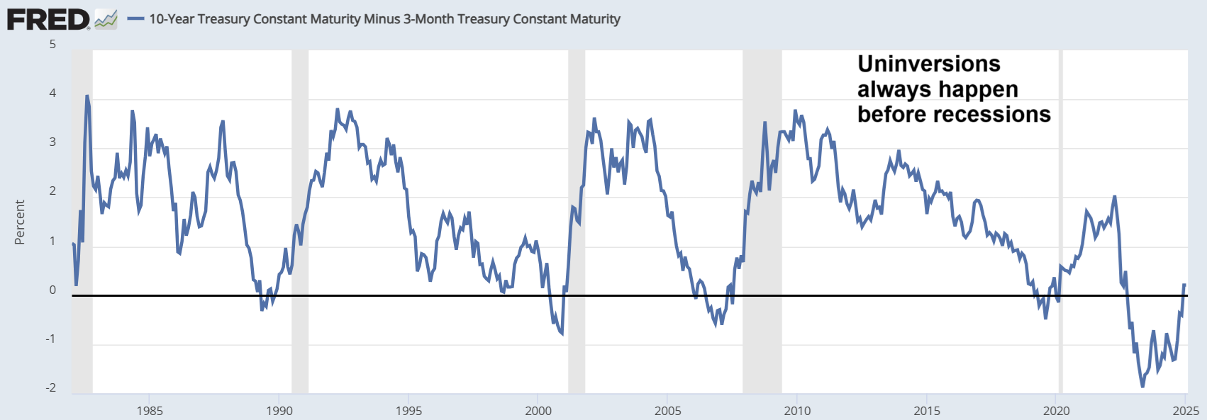
The figure below (source: Federal Reserve Bank of St. Louis) displays the spread between the 10-year and 3-month U.S. Treasury yields from the early 1980s through 2025. This yield spread is a closely watched indicator in financial markets, as it reflects investor expectations about future economic conditions. A yield curve inversion—occurring when the spread falls below zero, meaning short-term interest rates exceed long-term rates—has historically been associated with upcoming recessions. Economists and policymakers often regard this inversion as a reliable leading indicator, given its strong track record in signaling economic downturns with a lead time of several months to over a year. As shown in the graph, each sustained inversion over the past four decades has typically preceded a recession, underscoring its continued relevance in macroeconomic forecasting.


It is important to note that the yield curve typically un-inverts, or returns to a positive slope, before a recession actually begins. In the graph, recessions are represented by the shaded areas, and a close examination reveals that the un-inversion often precedes the onset of these downturns. However, the time gap between the un-inversion and the start of a recession can vary significantly, ranging from a few months to over a year. This variability highlights the complexity of using the yield curve as a precise timing tool, even though it remains a valuable early warning signal. For a brief discussion on this pattern, along with a few other related topics, please refer to the video linked below.

Wednesday, April 30, 2025

A simulation-based valuation of the S&P 500: April 2025

The figure below shows two simulation-based valuations of the S&P 500. They assume a fair price-to-earnings (PE) ratio for the S&P 500 that is the inverse of half of the 10-year U.S. Treasury yield. The price (at the top) is the most recent top value of the S&P 500.


The numbers on the left consider a more benign scenario: S&P 500 earnings in 2025 are up by 13% from the previous year, and the 10-year U.S. Treasury yield is at 3.61%. The numbers on the right refer to a less positive scenario: S&P 500 earnings are up by 6%, and the 10-year U.S. Treasury yield is at 4.17%.

The second scenario takes us to a fair price for the S&P 500 of 2,673.79, which is 56.48% down from the most recent high. The video linked below discusses these simulations, some of the most recent values for the simulation inputs, and a few other things.

Monday, March 31, 2025

Long treasuries as no expiration puts on the S&P 500

The table below shows the variation in the price of the Vanguard Long-Term Treasury Index Fund ETF (VGLT) from May 2019 to April 2020, which was a period where the Fed reduced its federal funds rate from 2.39% to 0.05%. The S&P 500 crashed during this period.


As you can see, an investment in the VGLT early in that period would have appreciated about 31% at the end of the period. The VGLT is one of the lowest cost ETFs investing in long treasuries. This would have made purchasing VGLT shares analogous to buying “no expiration puts” on the S&P 500, with an extra advantage – the VGLT shares paid an interest.

The video linked below provides a brief discussion on these a few other related issues. Disclosure: the author owns VGLT shares at the time of this writing.

Thursday, February 27, 2025

PE-based valuation of companies: A five-minute strategy


The table below shows the simulation-based fair value of the price-to-earnings (PE) and price-to-earnings-to-growth (PEG) ratios associated with various annual earnings growth rates. It uses an approach discussed in this blog (). The lowest growth rate shown is minus 50 percent, which would refer to a company whose net profits are going down by 50 percent every year. The highest growth rate shown is 100 percent, for a company whose net profits are doubling every year.


Generally speaking, a PE of 12 is considered indicative of fair value, and so is a PEG of 1. As you can see, these are gross simplifications that would apply only to a company whose annual earnings growth rate is about 10 percent. By contrast, a company whose earnings are contracting at a 2 percent annual rate would be fairly valued with a PE of 6.51 and a PEG of -3.25. At the other end of the growth rate scale, a company whose earnings are growing at an annual 75 percent rate would be fairly valued with a PE of 260.47 and a PEG of 3.47.

As we can see, the relationship between the PE and PEG ratios is nonlinear. This is why valuations sometimes look odd to those thinking in terms of a PE of 12 and a PEG of 1. High growth companies, often in cutting-edge technology areas, may be fairly valued at PEs that look astronomical and PEGs that are significantly greater than 1. The video linked below discusses this in a bit more detail.

Tuesday, January 28, 2025

The yield curve uninversion is here

The figure below shows the graph of the 10y-3m Treasury yields for the period going from the early 1980s to 2025. The inversion in the 10y-3m graph is the best indication of an impending economic recession in the US, and that graph uninverts immediately prior to a recession.


As you can see, the uninversion of the 10y-3m Treasury yield curve is here, and universions always happen before recessions. Interestingly, this is happening at a time when many aspects of the US economy look strong. The video linked below provides a brief discussion on this a few other related issues.

Thursday, November 21, 2024

How inflation widens the wealth gap

The figure below shows the pay of two individuals, L (lower pay) and H (higher pay). Their pay starts respectively at $50K and $100K in year 1, and is then adjusted by the official rate of inflation, until year 20. We assume two rates of inflation, 0.5% and 5%, which leads to the values on the left and right tables. We also assume that individual L has no savings (i.e., earns only enough to live paycheck by paycheck), and that individual H saves the difference and invests it in a financial instrument that pays the official rate of inflation (e.g., a specialized money market fund).


Looking at these gaps, one could conclude that the rate of inflation does not make any difference in either the pay or wealth gap between individuals L and H. H’s pay is twice L’s pay regardless of inflation rate. And the amount saved by H in year 20 at 5% inflation is worth the same as the amount saved in the same year at 0.5% inflation, in terms of purchasing power. These conclusions may make sense, until we consider two facts that are illustrated in the figure below from FRED, which shows the rate of inflation for IT products and services.


The first fact we should consider is that the rate of inflation is not the same for all items. We can see that, for IT products and services, the rate of inflation is negative most of the time in the graph. Given this, individual H can buy significantly more IT items in year 20 at 5% inflation, and certainly way more than individual L at 0.5% inflation. The second fact we should consider is that the rate of inflation becomes very negative near or during recessions (see left part of the graph, near 2008). This places individual H at an advantage at 5% inflation, because as prices go down, H’s higher absolute savings will buy more.

As you can see, the wealth gap widens more at higher inflation rates. It is noteworthy that more and more of people’s expenses, even large ones, are related to IT products and services. But inflation for these has been typically negative in modern times. So, someone whose pay is adjusted for inflation at a higher rate will be able to buy more and more of these products and services as time goes by. Moreover, that person will also be in a better position to take advantage of economic downturns that lead to sharp downward corrections in prices, which happen regularly. The video linked below provides a brief discussion on this a few other related issues.

Thursday, October 31, 2024

How to beat the S&P 500 without much effort: A one-year moving average strategy


Summary

- One of the most successful strategies for long-term investment returns is to buy and hold a broad-coverage index fund.

- The SPY is an exchange-traded fund (ETF) that tracks the S&P 500, and is a good example of broad-coverage index fund.

- A simple strategy can be devised to obtain even better than buy-and-hold long-term returns, employing fast- and slow-moving averages.

- We explain and test a one-year moving average strategy that in the long term performs significantly better than buying and holding SPY.

The one-year moving average for SPY from 1995 to 2018

The graph below has been created with Yahoo Finance (). It shows the variation of the SPY exchange-traded fund (ETF) from 1995 to 2018 (in red), plus the one-year moving average during that period (in blue). The SPY tracks the S&P 500 index, and had a net expense ratio of 0.09% at the time of this writing. One of the advantages of index funds is that they have a low expense ratio compared with actively-managed mutual funds.


Note that there are two moving averages in the graph: (a) the SPY “share” price (or net asset value per share) at any given time, which is the fastest moving average possible for the fund; and (b) the SPY’s one-year moving average, which is a slow-moving simple average of the fund’s share prices. (see ).

Simple inspection would suggest that, after an initial purchase, one would do better than holding SPY by employing a simple two-step strategy: (1) sell when the SPY crosses below its one-year moving average; and (2) buy back when SPY crosses above its one-year moving average.

A test of the strategy

While on the graph the simple strategy above may look appealing, the strategy must be tested with real data and under realistic assumptions. The figure below shows part of a screen snapshot of a test of the strategy, with multiple trades on a spreadsheet. Each row of the spreadsheet corresponds to one trade. The first row corresponds to the initial buy. A conservative fee of US$ 40 per trade is assumed, in part to account for bid-ask spread losses.


The figure below shows the final rows of the simulation, the result of a comparison buy-and-hold baseline strategy, and the percentage difference. Starting with an investment of US$ 100,000 made in January 1, 1995, the simple one-year moving average strategy gets us to US$ $980,558 on January 1, 2018. The buy-and-hold baseline strategy gets us to US $611,714. That is, the simple one-year moving average strategy performs about 60 percent better.


The simulation disregards dividends and sweep account gains (whereby cash earns interest). At the time of this writing, one could easily get money market yields in sweep accounts that were comparable in value to the SPY dividend.

Is the 365 days used for the moving average optimal? Probably not, but our simulation suggests that this number is effective at limiting false positives while at the same time capturing major drops of the index (e.g., those in the two recessions in the period considered). False positives would be much more frequent with a faster moving average, such as a 50-day moving average. If too frequent, false positives can significantly increase trading-related losses, to the point of negating the benefit of the strategy.

Sunday, September 29, 2024

How much do long Treasuries increase with each 1% decrease in the 10-year Treasury yield?

The figure below shows five values of the TLT exchange-traded fund, which tracks the value of Treasury bonds with maturities of 20 years or more (i.e., long Treasuries), and of the corresponding 10-year Treasury yields. The latter, 10-year Treasury yields, are highly correlated, in a lagged way, with the Federal Funds rate. This rate is set by the Fed.


As you can see from the best fitting line equation, there is an increase of approximately 19 points in the value of the TLT for each 1% decrease in the 10-year Treasury yields. So, if the Federal Funds rate us expected to go down, the gain likely to be obtained by investing in long Treasuries in quite attractive. The video linked below provides a brief discussion on this a few other related issues.