The table below shows the variation in the price of the Vanguard Long-Term Treasury Index Fund ETF (VGLT) from May 2019 to April 2020, which was a period where the Fed reduced its federal funds rate from 2.39% to 0.05%. The S&P 500 crashed during this period.
As you can see, an investment in the VGLT early in that period would have appreciated about 31% at the end of the period. The VGLT is one of the lowest cost ETFs investing in long treasuries. This would have made purchasing VGLT shares analogous to buying “no expiration puts” on the S&P 500, with an extra advantage – the VGLT shares paid an interest.
The video linked below provides a brief discussion on these a few other related issues. Disclosure: the author owns VGLT shares at the time of this writing.
This blog is about data analytics, statistics, economics, and investment issues. The "Warp" in the title refers to the nonlinear nature of investment instrument variations.
Monday, March 31, 2025
Thursday, February 27, 2025
PE-based valuation of companies: A five-minute strategy
The table below shows the simulation-based fair value of the price-to-earnings (PE) and price-to-earnings-to-growth (PEG) ratios associated with various annual earnings growth rates. It uses an approach discussed in this blog (). The lowest growth rate shown is minus 50 percent, which would refer to a company whose net profits are going down by 50 percent every year. The highest growth rate shown is 100 percent, for a company whose net profits are doubling every year.
Generally speaking, a PE of 12 is considered indicative of fair value, and so is a PEG of 1. As you can see, these are gross simplifications that would apply only to a company whose annual earnings growth rate is about 10 percent. By contrast, a company whose earnings are contracting at a 2 percent annual rate would be fairly valued with a PE of 6.51 and a PEG of -3.25. At the other end of the growth rate scale, a company whose earnings are growing at an annual 75 percent rate would be fairly valued with a PE of 260.47 and a PEG of 3.47.
As we can see, the relationship between the PE and PEG ratios is nonlinear. This is why valuations sometimes look odd to those thinking in terms of a PE of 12 and a PEG of 1. High growth companies, often in cutting-edge technology areas, may be fairly valued at PEs that look astronomical and PEGs that are significantly greater than 1. The video linked below discusses this in a bit more detail.
Tuesday, January 28, 2025
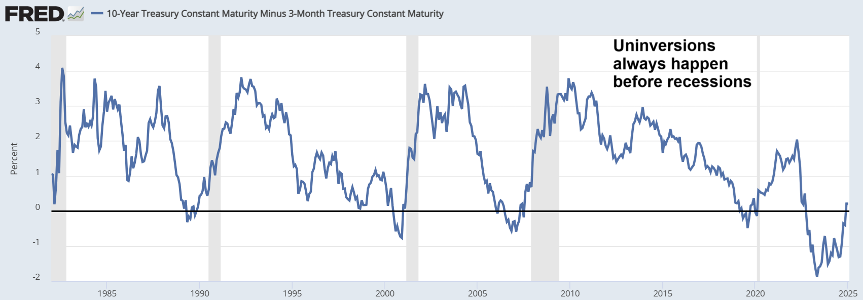
The yield curve uninversion is here
The figure below shows the graph of the 10y-3m Treasury yields for the period going from the early 1980s to 2025. The inversion in the 10y-3m graph is the best indication of an impending economic recession in the US, and that graph uninverts immediately prior to a recession.
As you can see, the uninversion of the 10y-3m Treasury yield curve is here, and universions always happen before recessions. Interestingly, this is happening at a time when many aspects of the US economy look strong. The video linked below provides a brief discussion on this a few other related issues.
Thursday, November 21, 2024
How inflation widens the wealth gap
The figure below shows the pay of two individuals, L (lower pay) and H (higher pay). Their pay starts respectively at $50K and $100K in year 1, and is then adjusted by the official rate of inflation, until year 20. We assume two rates of inflation, 0.5% and 5%, which leads to the values on the left and right tables. We also assume that individual L has no savings (i.e., earns only enough to live paycheck by paycheck), and that individual H saves the difference and invests it in a financial instrument that pays the official rate of inflation (e.g., a specialized money market fund).
Looking at these gaps, one could conclude that the rate of inflation does not make any difference in either the pay or wealth gap between individuals L and H. H’s pay is twice L’s pay regardless of inflation rate. And the amount saved by H in year 20 at 5% inflation is worth the same as the amount saved in the same year at 0.5% inflation, in terms of purchasing power. These conclusions may make sense, until we consider two facts that are illustrated in the figure below from FRED, which shows the rate of inflation for IT products and services.
The first fact we should consider is that the rate of inflation is not the same for all items. We can see that, for IT products and services, the rate of inflation is negative most of the time in the graph. Given this, individual H can buy significantly more IT items in year 20 at 5% inflation, and certainly way more than individual L at 0.5% inflation. The second fact we should consider is that the rate of inflation becomes very negative near or during recessions (see left part of the graph, near 2008). This places individual H at an advantage at 5% inflation, because as prices go down, H’s higher absolute savings will buy more.
As you can see, the wealth gap widens more at higher inflation rates. It is noteworthy that more and more of people’s expenses, even large ones, are related to IT products and services. But inflation for these has been typically negative in modern times. So, someone whose pay is adjusted for inflation at a higher rate will be able to buy more and more of these products and services as time goes by. Moreover, that person will also be in a better position to take advantage of economic downturns that lead to sharp downward corrections in prices, which happen regularly. The video linked below provides a brief discussion on this a few other related issues.
Looking at these gaps, one could conclude that the rate of inflation does not make any difference in either the pay or wealth gap between individuals L and H. H’s pay is twice L’s pay regardless of inflation rate. And the amount saved by H in year 20 at 5% inflation is worth the same as the amount saved in the same year at 0.5% inflation, in terms of purchasing power. These conclusions may make sense, until we consider two facts that are illustrated in the figure below from FRED, which shows the rate of inflation for IT products and services.
The first fact we should consider is that the rate of inflation is not the same for all items. We can see that, for IT products and services, the rate of inflation is negative most of the time in the graph. Given this, individual H can buy significantly more IT items in year 20 at 5% inflation, and certainly way more than individual L at 0.5% inflation. The second fact we should consider is that the rate of inflation becomes very negative near or during recessions (see left part of the graph, near 2008). This places individual H at an advantage at 5% inflation, because as prices go down, H’s higher absolute savings will buy more.
As you can see, the wealth gap widens more at higher inflation rates. It is noteworthy that more and more of people’s expenses, even large ones, are related to IT products and services. But inflation for these has been typically negative in modern times. So, someone whose pay is adjusted for inflation at a higher rate will be able to buy more and more of these products and services as time goes by. Moreover, that person will also be in a better position to take advantage of economic downturns that lead to sharp downward corrections in prices, which happen regularly. The video linked below provides a brief discussion on this a few other related issues.
Thursday, October 31, 2024
How to beat the S&P 500 without much effort: A one-year moving average strategy
Summary
- One of the most successful strategies for long-term investment returns is to buy and hold a broad-coverage index fund.
- The SPY is an exchange-traded fund (ETF) that tracks the S&P 500, and is a good example of broad-coverage index fund.
- A simple strategy can be devised to obtain even better than buy-and-hold long-term returns, employing fast- and slow-moving averages.
- We explain and test a one-year moving average strategy that in the long term performs significantly better than buying and holding SPY.
The one-year moving average for SPY from 1995 to 2018
The graph below has been created with Yahoo Finance (). It shows the variation of the SPY exchange-traded fund (ETF) from 1995 to 2018 (in red), plus the one-year moving average during that period (in blue). The SPY tracks the S&P 500 index, and had a net expense ratio of 0.09% at the time of this writing. One of the advantages of index funds is that they have a low expense ratio compared with actively-managed mutual funds.
Note that there are two moving averages in the graph: (a) the SPY “share” price (or net asset value per share) at any given time, which is the fastest moving average possible for the fund; and (b) the SPY’s one-year moving average, which is a slow-moving simple average of the fund’s share prices. (see ).
Simple inspection would suggest that, after an initial purchase, one would do better than holding SPY by employing a simple two-step strategy: (1) sell when the SPY crosses below its one-year moving average; and (2) buy back when SPY crosses above its one-year moving average.
A test of the strategy
While on the graph the simple strategy above may look appealing, the strategy must be tested with real data and under realistic assumptions. The figure below shows part of a screen snapshot of a test of the strategy, with multiple trades on a spreadsheet. Each row of the spreadsheet corresponds to one trade. The first row corresponds to the initial buy. A conservative fee of US$ 40 per trade is assumed, in part to account for bid-ask spread losses.
The figure below shows the final rows of the simulation, the result of a comparison buy-and-hold baseline strategy, and the percentage difference. Starting with an investment of US$ 100,000 made in January 1, 1995, the simple one-year moving average strategy gets us to US$ $980,558 on January 1, 2018. The buy-and-hold baseline strategy gets us to US $611,714. That is, the simple one-year moving average strategy performs about 60 percent better.
The simulation disregards dividends and sweep account gains (whereby cash earns interest). At the time of this writing, one could easily get money market yields in sweep accounts that were comparable in value to the SPY dividend.
Is the 365 days used for the moving average optimal? Probably not, but our simulation suggests that this number is effective at limiting false positives while at the same time capturing major drops of the index (e.g., those in the two recessions in the period considered). False positives would be much more frequent with a faster moving average, such as a 50-day moving average. If too frequent, false positives can significantly increase trading-related losses, to the point of negating the benefit of the strategy.
Sunday, September 29, 2024
How much do long Treasuries increase with each 1% decrease in the 10-year Treasury yield?
The figure below shows five values of the TLT exchange-traded fund, which tracks the value of Treasury bonds with maturities of 20 years or more (i.e., long Treasuries), and of the corresponding 10-year Treasury yields. The latter, 10-year Treasury yields, are highly correlated, in a lagged way, with the Federal Funds rate. This rate is set by the Fed.
As you can see from the best fitting line equation, there is an increase of approximately 19 points in the value of the TLT for each 1% decrease in the 10-year Treasury yields. So, if the Federal Funds rate us expected to go down, the gain likely to be obtained by investing in long Treasuries in quite attractive. The video linked below provides a brief discussion on this a few other related issues.
Thursday, August 29, 2024
How far are we from a recession according to the Sahm Rule in August 2024?
The figure below shows the adjusted three-month moving average of the national unemployment rate in the U.S. for the past 12 months, with the minimum and current values indicated at the bottom-left and top-right areas. This is known as the Sahm Recession Indicator, which signals the start of a recession when the it rises by 0.50 percentage points or more relative to its minimum value in the previous 12 months. The Sahm Recession Indicator has been named after economist Claudia Sahm.
If the adjusted three-month moving average of the national unemployment rate, or the the Sahm Recession Indicator, continues rising at the same rate, we should either be in recession right now in August 2024, or enter a recession within the next few months – according to the Sahm Rule, which is based on the Indicator. The video linked below provides a brief discussion on this a few other related issues.
Subscribe to:
Posts (Atom)